not just a shop have collaborated with the Arts SU to celebrate LGBTQIA+ History Month in February again this year. The LGBTQIA+ Showcase Competition was open to students across the university, tasking them with submitting a piece of artwork that encapsulates LGBTQIA+ History Month.
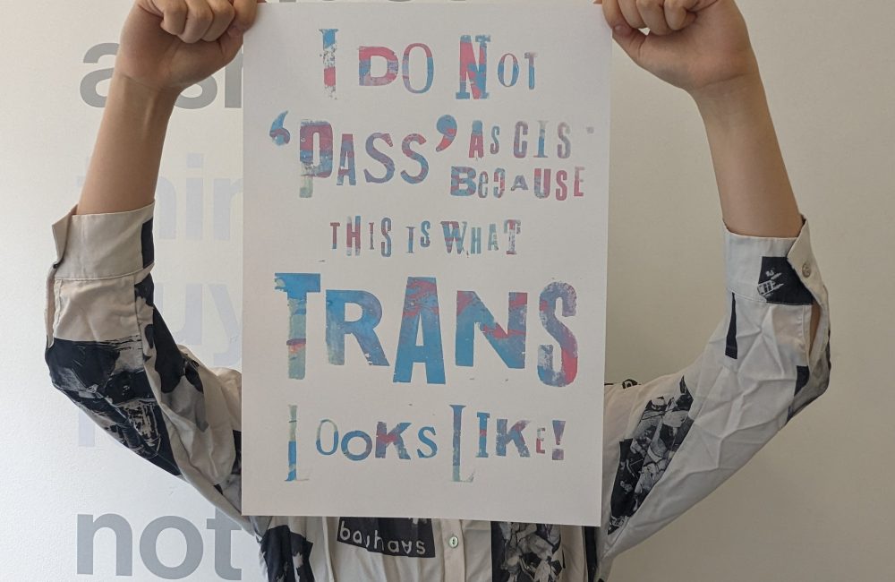
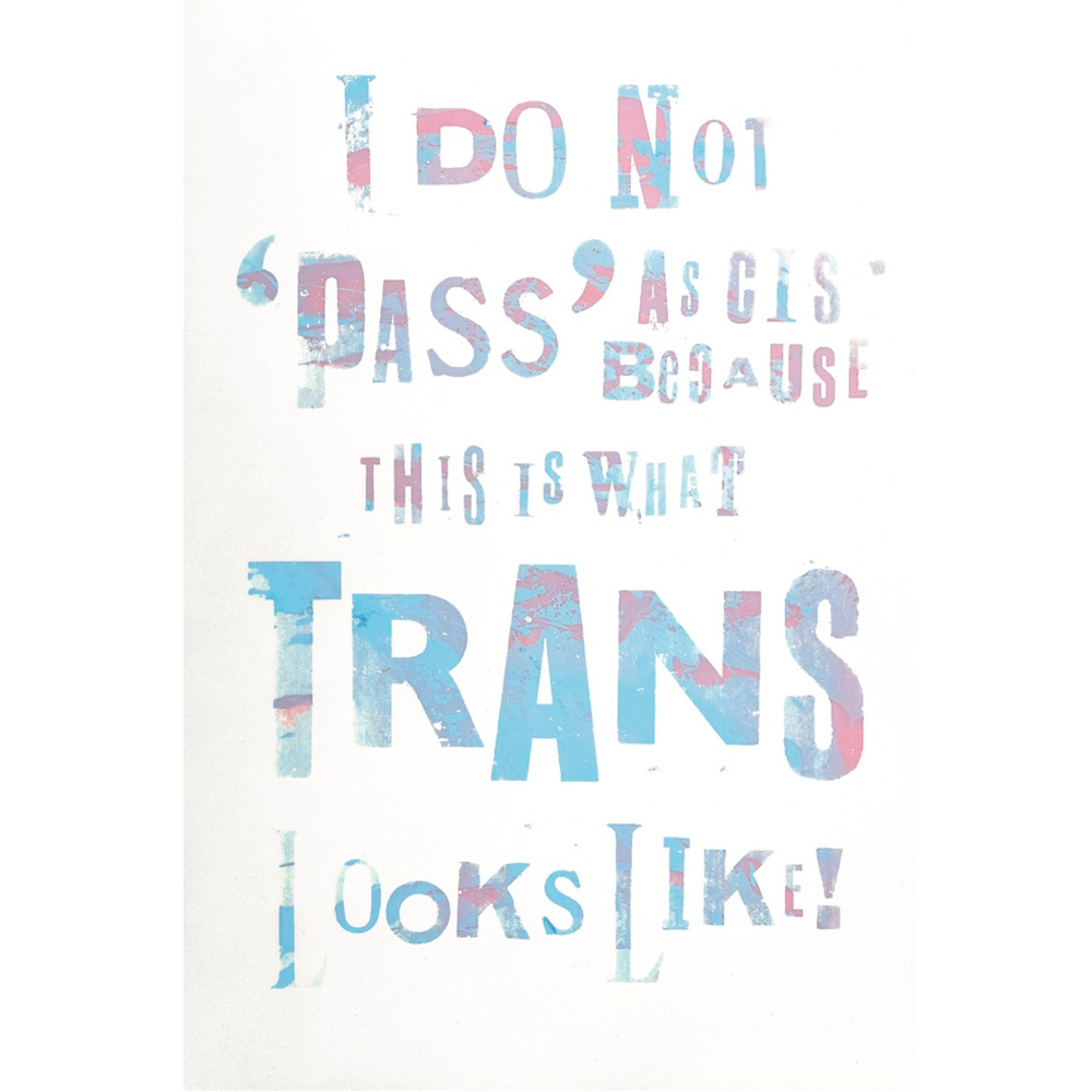
We are excited to announce Joles Wong as the winner of the LGBTQIA showcase competition run in collaboration with Arts Students’ Union. They are currently studying BA Graphic Communication Design at Central St. Martins. Their piece was inspired by their time volunteering at the Museum of Transology, traditional protest posters and queer typography. You can read more about their piece and their inspirations in the interview below.
What inspired your design?
The text I chose to screenprint is a quote taken from a stack of speech notes written by E-J Scott, the founder of the Museum of Transology (MoT), for London’s Trans Pride in 2022. I found these notes during an archiving lates session last year, when I first started volunteering with the MoT. I felt so much passion from this crumpled stack of handwritten messages, and I imagine how it would feel to have heard it in a crowd. But that moment had passed, and the sad reality of spoken word mediums is they do not offer a chance to be repeated for those who weren’t there at that exact protest, at that exact time. So to savor the passion that surged to my heart when I read these speech notes for the first time, I wanted to memorialize its message by making a part of it physical, and give its essence a new visual expression. In the archive we also collect a huge amount hand-made protest signs and placards. These signs as well as pieces from the “Reverting to Type 2020: Protest Posters” exhibition, inspired how I treated the text using letterpress and screenprint.
Did the competition give you a chance to explore a theme you might not have otherwise?
Definitely. I’ve only recently come into my identity, and I used to think my work should be separate from who I am. This competition gave me a chance to merge the two. It was gratifying to create something that says something about me and speaks to others as well. It’s also a reflection of the community at the Museum of Transology at the Bishopsgate Institute, where I volunteer.
Is the print also going to be on display at the Museum of Transology?
I plan to archive one of these, possibly the original, really large screen print. It’s inspired by a stack of speech notes used at London Trans Pride in 2022. The project was about memorializing spoken word and giving it a physical form.
How does your artwork encapsulate LGBTQIA+ History Month?
I believe Pride is a protest, and my print is inspired by traditional protest posters made in letterpress. The origins of pride as a protest couldn’t have existed without the lives of Trans people fighting for all queer people’s right to exist. Lately, the Western media has led discussions about trans people in such a way, that the idea of “LGB without the T” has resurfaced promoting transphobia from both in and outside of the queer community. This is extremely disappointing. As a people, we demand so much from trans people: policing presentation, representation and terminology. Frequently, discussions derail into baseless arguments talking about so-called “biology” that’s preventing many from accessing gender affirming care, when we know that the tools we need to fully express ourselves are costly and highly inaccessible to most people. I want this piece to remind everyone of the spirit of protest, how trans people have always been here, that our battle is intersectional and it is trans people who have ensured the freedoms that cisgender queer people are living out now. Therefore, we deserve to be respected regardless of how we look, and our stories need to be heard.
Do you have any LGBTQIA+ icons or artists who inspire you?
Recently I’ve been really interested in trans publishing groups, one of them being SISSY ANARCHY. I like their content for their super cool layout design and unique zine format. I also really enjoy going to publishing fairs, book fairs and zine fairs to see how people are using the medium of publishing and print to express queerness in addition to the words and images inside them. The work of Paul Soulellis and particularly his research into “What Is Queer Typography” was a huge inspiration for me when I was thinking about how to use type to express queerness when designing my print.
What was your process for creating the design?
First, I started by asking the members of the Museum of Transology community about what lines in E-J Scott’s speech spoke to them and the one that people quoted the most was the one I chose to print. Then, I sketched a few designs for how to lay out each word all neat and orderly, but no matter what I tried they all felt slightly off to me. This is when I read “What Is Queer Typography” by Paul Soulellis, who proposes that anything that pushes back against the standards of typography as it’s been taught and practiced for centuries (‘control, precision, preservation of standards, the idea of perfect legibility’) can get us closer to queer acts, people, and places. In my initial sketches there is a clear influence of the letterpress canon. I was trying to make my work look “serious” in order for the message to be taken seriously. But one thing queerness is not – is conformity. So I scrapped everything and went back to re-engage with the original material and start over. In the letterpress workshop I decided to just experiment with freehanding the text using woodcut letters and placing them onto paper one by one. Once I printed the full message I scanned and resized it onto A1 for screen printing. Seeing the artwork on the screen really highlighted the natural imperfections of the woodcut letters which gave the text a lot of character. I then chose to highlight this effect by using a palette knife to apply streaks of ink in the colours of the trans flag which created a beautifully textured multi-coloured image.
How do you feel about the final piece with the UV spot coating?
I learned a lot from this experience, especially about wholesaling and retailing. I didn’t get to see the first samples, so it was a big guess. But I’m really happy with how it came out. The UV coating adds a dimension you wouldn’t get with handmade prints, making it perfect for a limited edition.
What feelings would you like people to have when they look at your piece?
I hope it jumps out at people the way the words did for me. I want it to speak to something inside them and promote solidarity. It’s a reflection of the passion and energy of the trans community, and I hope it resonates with everyone who sees it.
How did you hear about the competition?
I heard about it from a friend who is also a maker at not just a shop. They sent me the link via WhatsApp. The process was really easy; I just filled out the application form back in December.
What projects are you working on right now?
This year I’ve been exploring many more printing methods because I’m really passionate about pushing analogue processes through my design work and using them to make educational tools/objects. I have really enjoyed using risograph printing in particular, and would like to expand my practice with writing to hopefully publish a zine of my own one day.
Where can we find more of your work/do you have anything coming up you’d like to share
You can find me on instagram @jolezwong where I make moves in silence, as loudly as possible. If I’m doing anything, ever, at all – you’ll definitely hear about it there.
Joles Wong’s work is available to buy as a limited edition print in not just a shop. Their piece is a powerful reflection on identity, community, and the ongoing fight for trans rights.