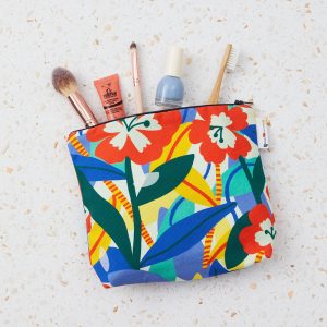
Christmas has well and truly arrived at not just a shop, starting with a brand new festive window display designed by illustrator and UAL graduate Teresa Rego. We got together with Teresa to find out more about her beautiful design…
What was the inspiration behind the design for the window display?
I wanted to create a window with bold shapes inspired by the Christmas spirit, candies, trees and decorations. Colour and composition are very important in my work, so I created bold shapes that would be arranged to create the silhouette of a Christmas tree and all the decorations surrounding it.
Have you ever worked with vinyl or created a window display before?
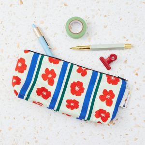
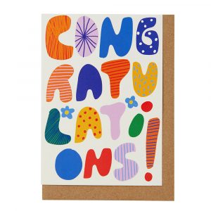
Yes, I had the pleasure of working with other amazing brands in London for which I developed original illustrations that were displayed as vinyl. This year I developed window illustrations for Bubblewrap in Chinatown and for La Gelatiera in Covent Garden. Previously I’ve done a Wall illustration for a restaurant branch Mamalan that was shortlisted for AOI world illustration awards.
How does it feel to have your work displayed in such a prime location in central London?
It is always such a great opportunity to have the chance to display my designs in London. Not only is the location great but the shop itself is original and unique. The space is in harmony with my work style, so I think they both fit very well together!
What was the process of designing the window display like?
I knew I had to develop a window in my own style that also represented the Christmas spirit and the shop style. From the beginning I wanted to use bold shapes built with different textures and patterns, similar to what I use in my illustration work. I started by developing several compositions with abstract shapes that could represent Christmas elements. I experiment a lot with collage in order to re arrange shapes and create new textures. I thought that one of Christmas’ strongest and more universal symbols was the Christmas tree. So from there, I made my bold shapes into a composition that would represent this icon with bold colours and patterns in an asymmetric arrangement.
The elements are organised within 3 different plans: the 1st plan is the window vinyl; the 2nd is the big central triangle and the 3rd and last is the cardboard pieces hanging.
What do you want viewers to take away from your work?
I want viewers to perceive the different layers, textures, patterns and shapes from this illustration. I hope that they’ll notice how it looks different depending on where you are standing. This work is about composition first and foremost. Viewers can see that with very simple and familiar shapes, it’s possible to create something that has a joyful festive feel to it.
What three things are essential to your practice?
Experimentation, perseverance and colour
Do you have any examples of other artworks?
Yes, I’ve done illustrations for Vista Alegre, Sacoor Brothers, Doc Cotton, Hernest project, la Gelatiera, Bubblewrap, La Gelatiera and Mamalan
What is the most inspiring place you’ve been to in London?
St Dunstan Church in the east, for its diversity. it combines history, with architecture, nature and so many textures, and its located in central London.
What advice would you give to students wanting to run their own business?
I do believe that having time to work on your own style and personal projects is an important step. I’d advise every creative to make your own portfolio, even if you are not taking comissions, just create your own projects to keep you working
Also don’t give up! Be persistent even if you are not getting were you want for now. Setting up small goals is easier and less scary and makes it seem more achievable to get to where you want to go.
Thanks Teresa! Head to not just a shop at 272 High Holborn to see Teresa’s window design for real.